Following up on our look at Bernalillo County traffic fatality figures earlier this week, here are two vastly different presentations of data, one overly complex and the other perhaps too simple. Working backwards, we’ll start with a challenging visual and conclude with an easier set of facts. Notably, both elicit questions with no easy answers.
The Challenging
A reader observed from our earlier post looking at BernCo traffic fatalities and population growth that “I can’t stop staring at the blue line showing that BernCo essentially hasn’t grown at all since 2010…” With that in mind, we compared traffic fatality/population figures with BernCo and two places we all know have grown like crazy the past 15 years: Denver and El Paso (Colorado Springs) Counties, Colorado. Here’s a look at traffic fatalities and population growth for these three counties:
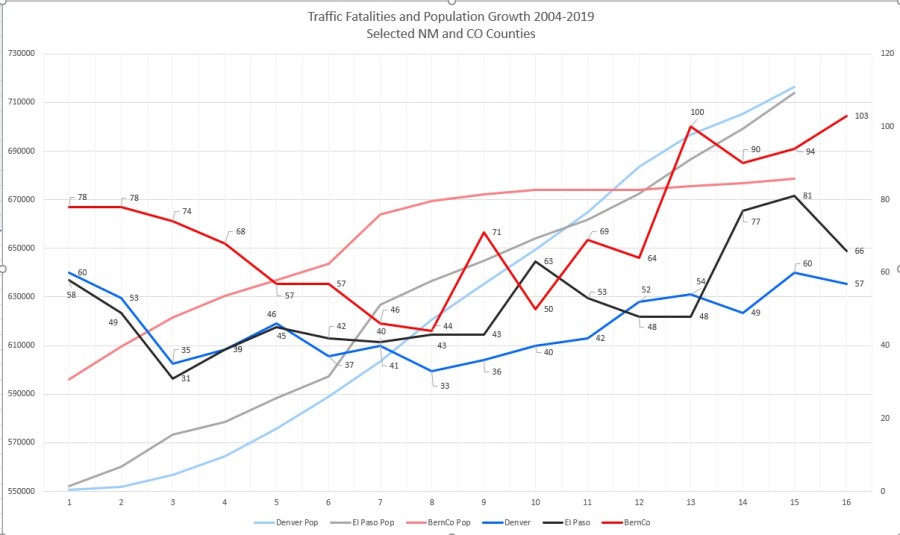
Yeah, there’s a ton o’ things going on in this graph, including the maddening inability for me to figure out how to construct a “combo” graph in Excel that has years instead of the 1, 2, 3… you see in the X-Axis. Trust me, it’s 2004-2019 (2018 for the population figures).
In short, the muted red (BernCo), blue (Denver) and black (El Paso) lines without data labels show population. BernCo starts well ahead of either Denver and El Paso at around 525,000, then is passed by the zooming Denver/Colorado Springs growth while BernCo growth remains stagnant. Also keep in mind that Denver City/County does not take in the many surrounding suburbs we think together of as “Denver,” a condition that seems to be eventually leading toward Colorado Springs itself becoming just another suburb in a veritable Front Range wall o’ people by sometime scarily soon.
What does the above indicate?
Your mileage, so to speak, might vary, but I’m most struck (pardon the pun) by the fact Bernalillo County has had more traffic fatalities than either of the two CO counties in all but one year of the data set (2013), a gap re-widening since 2014. More people now live in Denver and El Paso County, but nowhere near as many people are killed trying to get somewhere in those counties compared with good ‘ol BernCo.
Why is that? Being no expert, I’ll just leave that for others more knowledgeable. I will only add that, as rural fatalities tend to be at a higher rate, El Paso County is almost twice as large as BernCo. So that doesn’t necessarily seem to be a factor.
The Easier
Some states, including New Mexico, consistently have more traffic fatalities per 100 million vehicle miles traveled than others, including Colorado. Looking at numbers 1994-2018, New Mexico has averaged 1.731 fatalities/100mvmt versus Colorado’s 1.332, and Colorado has consistently stayed right around the national average of 1.379.
States like Mississippi (2.122) and South Carolina (2.022) almost always top the so-called charts, while Minnesota (0.951) and Massachusetts (0.746) are consistently around the relative safest. With few exceptions, states very much tend to stay in the same relative position each year, wavering together as national trends change in tandem, some remaining consistently higher than others.
The ten highest averaging states over the period of 1994-2008 are:
- Mississippi: 2.122
- Montana: 2.079
- South Carolina: 2.022
- Louisiana: 1.956
- Arkansas: 1.918
- West Virginia: 1.847
- Arizona: 1.818
- South Dakota: 1.766
- Kentucky: 1.764
- New Mexico: 1.731
Even with *25 years of data reflected in the averages above, the Top Ten List doesn’t move much each year. Here’s the most recently recorded year of 2018:
- South Carolina: 1.83
- Mississippi: 1.63
- (tie) Louisiana: 1.53
- (tie) Arizona: 1.53
- West Virginia: 1.51
- (tie) Kentucky: 1.46
- (tie) Alaska: 1.46
- Oklahoma: 1.44
- (tie) Montana: 1.43
- (tie) New Mexico: 1.43
What does the above indicate? Why is that?
I don’t know. Why is it so consistently easier to get killed trying to get somewhere in some states than others?
Thoughts?
*The 1990s experienced more traffic violence than any other time in this data set. Generally speaking, the late 1990s and 2000s saw lower fatalities rates, with 2010s rates trending higher, but still below those in the 1990s.
