
Wanna see the easiest, quickest illustration of how economic vulnerability correlates with death/injury to those trying to walk our roads?
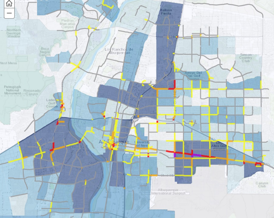
Above is a screengrab from the (prepare yourself for some acronyms) Mid-Region Council of Governments (MRCOG) Albuquerque Area High Fatality and Injury Network (HFIN) online set of maps. As stated on the page, “this map highlights corridors with high rates of crashes involving people walking.”
The obsessively nerdy among us (blogger raises hand) can deeply dive in the stats and criteria via the link, but the simple, and extremely informative/compelling, explanation is:
- The red and purple line segments are where rates of walking injury/death are highest (Coors, Central, Montgomery/San Mateo)
- The blue shading represents level of economic vulnerability (in less agreeable language, where the poor people are), with the most vulnerable neighborhoods darkest blue.
Notice anything?
This blogpost almost became a mere Tweet because, that’s it, “that’s the Tweet,” to use the platform’s parlance.
Nothing illustrated above is shocking or even surprising, yet seeing so simply the nexus of poverty and deadly walking danger, and visually demonstrating the critical need for us to immediately address our most deadly roads/intersections (again: Coors, Central, Montgomery/San Mateo), make this map one that should be burned/hardwired into the mind of everyone.
Particularly those who lead our walking infrastructure decision-making, almost all of whom do not live in the map’s darkest blue areas. If they did…would it look like this?
