
Once a schoolteacher, always a bothersome person schoolteacher. Before hanging up my sweater vest around 2016, my lesson planning was heavily centered on putting together bad data interpretation I found on the internet and presenting it to students with “essential questions,” such as, “Why is this bad data interpretation?”
Hey, it was a living and it sure as Hell beat using boring, dry, state-sanctioned lessons.
The following graph/interp from page 30 of that MRCOG “Metropolitan Transportation Plan 2045” draft that I wrote about yesterday has me thinking back to those sweater vest days.
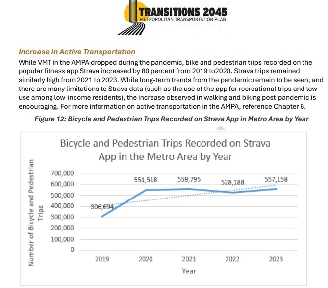
Assignment: In a succinct, yet thorough sentence or three, explain what’s wrong with the following assertion: “While long-term trends from the pandemic remain to be seen, and there are many limitations to Strava data (such as the use of the app for recreational trips and low use among low-income residents), the increase observed in walking and bike post-pandemic is encouraging.”
Of course the answer is: “A veritable shit-ton of things are wrong with this interpretation. Here are the most important wrong things.”
This sets up as a good lesson, methinks, because students can attack the MRCOG interp on a variety of open-ended fronts, but only after they think about it for a few seconds. Note to those considering the teaching profession: Forcing students to think is good.
So students dearly loved BB readers…what’s wrong with the proferred interpretation of this graph?
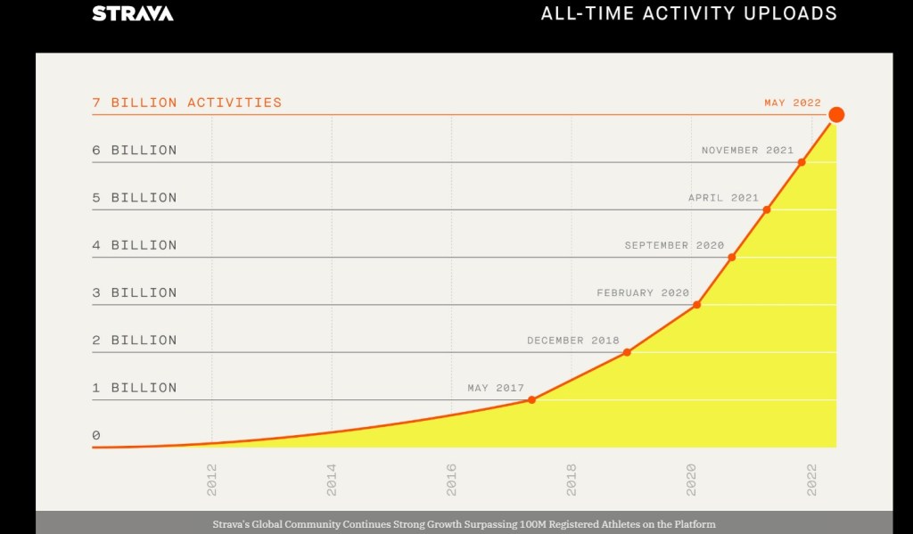
It’s easier to see the tractor-trailer wide holes in finding the foibles in MRCOG using “encouraging” (some admitted by MRCOG in the quoted statement) if one has ever been a Strava user, but not essential. At least I think so. I’ve been using Strava since 2017, and from that experience have gained two bits of relevant “local knowledge.”
- Strava has gotten more popular worldwide (see below) in a trend hastened by the pandemic.
- There’s a free version of Strava, meaning once one becomes a Strava user it don’t cost nothing to continue being one.
IMHO, the big reason why this local knowledge isn’t required to see the interpretative holes is, for one thing, free app usage tends to follow this trend regardless of type. Have you ever gone back and checked how many free apps you still “belong to,” even though you forgot about them years ago? It’s kinda scary.
So, the MRCOG plan employs the term “encouraging” as though the graph illustrates that more people continue to walk and ride bicycles at a greater rate that began with the pandemic. This may be true, but this graph doesn’t prove that. It doesn’t even argue that conjecture well. All it likely tells us is that there are more Strava users and Strava-recorded activities in the area, just as has been the case everywhere else:
It’s a fair student blogpost reader who might argue that the need to know something about Strava makes this assignment unfair. I’ll grant you that, and reply by saying that teaching students things the teacher knows that students don’t (yet) is kinda what makes the pedagogical jukebox play.
More to the point here, the folks at MRCOG (and its consultants) sure as Hell know of Strava’s rising popularity and also sure as Hell know how disingeneous it is to present the aforementioned graph/interpretation as somehow proof that more folks are walking and biking:

Heck, one might argue the graph above really seems to indicate that area walking/riding has lessened after plugging in continued growth in Strava users. We don’t know for sure, but we do know this graph doesn’t necessarily say what we’re being told it says.
Thanks for participating in today’s lesson. As my former students continually pointed out to me back in the sweater vest days, “Mr. Key, there’s really no right answer to this question. It’s a dumb question.” Guilty. Guilty as charged.
Happy New Year, everybody. Ready or not.

One has to wonder if they’re seeing the same increase in the ped/bike counters installed on various pathways around town.
LikeLike
An excellent observation/wonder! Answer: No, we’re generally not seeing an increase, although MRCOG now has a spiffy “dashboard” to see the numbers (at least through 2022). http://mrmpo.maps.arcgis.com/apps/MapSeries/index.html?appid=4f7734aebc7347d5812f564a92c4e531
In short, 2022 (872,133) overall counts for all reporting detectors was up about 30,000 from 2019 (842,797). Yes, those figures are compiled by the very organization putting out the Plan, and that organization didn’t use them to assert a rise in walking/cycling. Interesting. Thanks for the observation/wonder!
LikeLike