
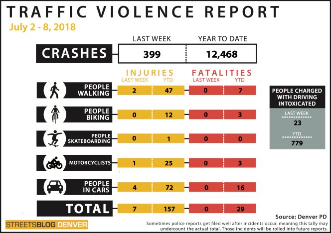
I’ve spent the past few days writhing in complete envy over the graphic above. What a great way of relating “Traffic Violence” data! Streetsblog Denver’s approach both graphically and in terms of recording up-to-date crash/arrest data is ne plus ultra, and I say that as one who has looked around for this kind of stuff for quite a while.
Whenever the envy subsides enough to perform actual work, we at BB ponder, chat and plan ways to be anywhere close as good in relating Burque data. We’ll have more about that in coming weeks, hopefully, if this crushing envy doesn’t squash all thinking on the subject.
In the meantime, we here in ABQ continue to be stuck in a pattern recently noted in a research study from Nashville’s Tennessee State University. As Nashville Public Radio reported:
“…researchers said they found that roughly 45 percent of pedestrian fatalities go unreported in local news outlets, and that when they do, the details provided by police and journalists may be contributing to misperceptions about why pedestrians die.”
Efforts by Streetsblog Denver, both in terms of research and visualization, help scrape away those misperceptions. Speaking of Nashville, the same Nashville Public Radio story mentions the Nashville Pedestrian Death Registry, which maps and tries to pass along further personal details on those killed walking the streets of Music City.

These efforts are precisely where BB seeks to go in informing you, dear reader, about the “traffic violence” on our streets. It’s great to see models such as these as we craft data collection and visualization means to do so here.
Have a great weekend, everybody!
